How to Choose the Perfect Color Palette for Your Living Room
Choosing the perfect color palette for your living room is less about strict rules and more about understanding how color behaves in a real, lived‑in space. Use the steps below as a practical guide rather than a rigid formula.
1. Start With Your Living Room’s “Given” Elements
Before picking paint chips, look at what you can’t or don’t want to change:
- Flooring (wood tone, tile, carpet color)
- Large furniture you’re keeping (sofa, armchairs, media unit)
- Fixed finishes (fireplace stone, built‑ins, window frames)
- Natural light (direction and intensity)
These existing elements should guide your palette.
Tip:
Lay out a few key items together (a sofa cushion, a piece of flooring, a curtain sample). Take a photo in natural daylight. This becomes your “starting board” for choosing colors that harmonize.
2. Decide How You Want the Room to Feel
Color is emotional. Clarify the mood first, then choose shades that support it.
- Calm and airy: soft neutrals, cool blues, blue‑grays, gentle greens
- Warm and cozy: warm whites, beiges, terracotta, camel, deep greens
- Elegant and sophisticated: muted tones, charcoal, inky blue, taupe, ivory
- Playful and energetic: clear brighter hues (teal, mustard, coral) used as accents
Write down three words that describe your ideal living room (e.g., “calm, bright, relaxed”). Use these as a filter: if a color fights your three words, skip it.
3. Choose a Base: Warm vs Cool Neutrals
Most successful living‑room palettes are built around a neutral base.
Warm neutrals
- Cream, beige, greige with yellow or red undertones
- Feel inviting and cozy
- Work well with warm woods, terracotta, brass
Cool neutrals
- Gray, off‑white with blue or green undertones
- Feel fresh and modern
- Suit cool flooring, black metal, crisp whites
How to test undertones:
Hold the paint sample against a sheet of pure white paper. Does it suddenly look pinkish, yellowish, greenish, or bluish? That subtle undertone matters once it covers a whole wall.
4. Use a Simple Color Framework
To keep the palette cohesive, follow a structure. Two easy options:
Option A: 60–30–10 rule
- 60% – Dominant color (usually walls and large area rug)
- 30% – Secondary color (sofa, curtains, major furniture pieces)
- 10% – Accent color(s) (pillows, smaller decor, art)
Example:
- 60% soft warm white
- 30% sandy beige (sofa, curtains)
- 10% deep olive and black (pillows, frames, vase)
Option B: 3–5 color palette
Pick:
- One main neutral
- One secondary neutral
- One main accent color 4–5. One or two supporting accent shades (slightly lighter/darker or neighboring colors on the color wheel)
This gives variety without chaos.
5. Consider Natural Light and Room Orientation
The same color looks completely different depending on light.
North‑facing rooms
- Light tends to be cool and grayish
- Better with: warm whites, creams, warm greiges, soft terracotta, warm greens
- Avoid: very cool grays; they can look flat and dull
South‑facing rooms
- Plenty of warm light most of the day
- Can handle: cooler neutrals, greiges, blue‑grays, darker tones
- Strong colors may look more intense here
East‑facing rooms
- Cooler in the afternoon, warm in the morning
- Consider a color that looks pleasant in both warm and cool light
- Gentle neutrals and mid‑tones often perform well
West‑facing rooms
- Dimmer and cooler in the morning, golden in late afternoon
- Warm colors can glow beautifully in evening light
- Test bold warm shades carefully; they may feel too strong at sunset
Always test paint in the actual room on all key walls and observe it at different times of day.
6. Balance Color Saturation and Contrast
Think in terms of how intense and how contrasting your colors are.
Saturation (how vivid the color is)
- Highly saturated = bold, lively, but can be tiring in large doses
- Desaturated = softer, more timeless, easier to live with
For living rooms, a good rule is:
- Use more muted tones on large surfaces (walls, big furniture)
- Use stronger, richer colors in small accents
Contrast (light vs dark, cool vs warm)
- High contrast (dark sofa on pale rug, white walls with black frames)
Looks dramatic and modern but can feel busy if overdone - Low contrast (similar lightness values)
Looks calm, soft, and more minimal
Decide what suits your style: soft transitions or sharp differences.
7. Work With the Color Wheel (the Easy Way)
You don’t need to be an artist to use basic color relationships.
Monochromatic palette
- One color in different tints and shades (e.g., various blues)
- Very soothing, sophisticated
- Avoid flatness by mixing textures (linen, wood, metal, wool)
Analogous palette
- Colors that sit next to each other on the wheel (blue–green–teal, or yellow–orange–red)
- Naturally harmonious, good for relaxed but interesting spaces
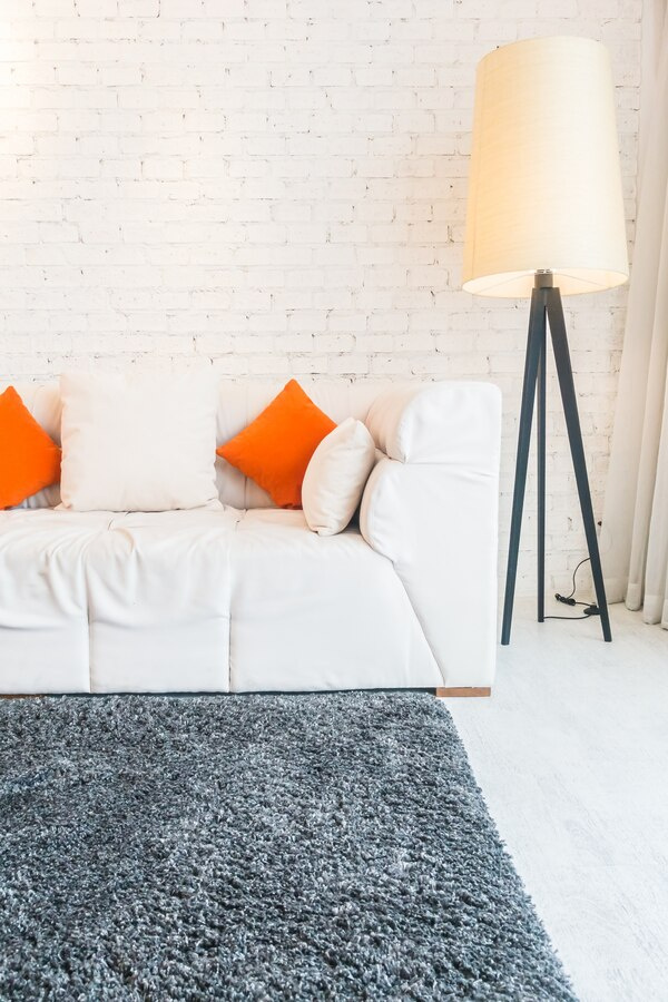
Complementary accents
- Colors opposite each other (blue/orange, yellow/purple, red/green)
- Use one as the main color, the opposite only in accents
- Adds energy and focus without overwhelming if you keep one side dominant
8. Let One Item Lead the Palette
If you feel stuck, choose a “hero” piece and build from it:
- A rug with multiple colors
- A piece of art you love
- Patterned curtains or a statement armchair
Pull 2–3 colors from this item:
- A background color for your walls or largest pieces
- A mid‑tone for secondary items (curtains, chairs)
- A deeper or brighter accent
This creates instant cohesion.
9. Coordinate With Adjacent Spaces
Your living room does not exist in isolation. If you can see the hallway, kitchen, or dining area from the sofa, their colors should relate.
- Keep a consistent undertone across main neutrals in open spaces
- Reuse at least one color (or a close cousin) from the living room palette in neighboring rooms
- Vary depth instead of hue: if the living room walls are light greige, a nearby hallway could be a slightly deeper greige from the same paint strip
This makes your home feel more intentional and less patchwork.
10. Mix Textures and Materials, Not Just Colors
A “flat” room is often missing texture, not more colors.
Combine:
- Soft: linen, cotton, velvet, wool throws
- Hard: wood, stone, metal, glass
- Matte and glossy finishes
You can keep the color palette restrained and still have a rich, layered look through material contrast.
11. Plan for Real Life (Maintenance and Practicality)
Think about how the room is used:
- Kids or pets?
Medium‑toned fabrics and rugs hide stains better than pure white or very dark. - Dust and fingerprints:
Dark glossy surfaces show everything; matte mid‑tones are more forgiving. - Small room?
Lighter colors on walls and large furniture will visually expand the space. - Very large or lofty room?
Slightly deeper wall colors can make it feel cozier and less cavernous.
A beautiful palette that you can’t maintain will quickly stop looking beautiful.
12. Test Before You Commit
Never choose paint solely from a tiny chip.
- Buy sample pots or peel‑and‑stick swatches.
- Test at least 2–3 options for each color you’re considering.
- Place samples on multiple walls at eye level and near the floor and ceiling.
- Look at them in:
- Morning light
- Midday
- Evening (with lamps on)
Wait a few days before deciding. One color usually emerges as the clear winner once you live with it briefly.
13. Add Personality With Flexible Accents
Keep your big investments (sofa, large rug, major cabinets) in versatile colors. Then express personality through pieces that are easy to change:
- Cushions and throws
- Lampshades
- Artwork and framed prints
- Vases, books, decorative objects
Use these to:
- Refresh the look seasonally (cool blues in summer, rust and mustard in fall)
- Experiment with trends without repainting the entire room
14. Simple Ready‑Made Palette Ideas
To make this more concrete, here are a few reliable palettes:
Calm Scandinavian‑inspired
- Walls: soft warm white
- Sofa: light gray‑beige
- Wood: pale oak
- Accents: muted sage, charcoal, black metal, off‑white textiles
Warm and cozy classic
- Walls: warm greige or light taupe
- Sofa: oatmeal or camel
- Wood: medium walnut
- Accents: deep navy or forest green, brass, cream
Modern and bold (used sparingly)
- Walls: crisp but not stark white
- Sofa: charcoal gray
- Large rug: neutral with subtle pattern
- Accents: mustard, teal, black, warm wood
Use these as starting points, then adjust to your taste and your room’s light.
Choosing the perfect color palette for your living room is about observing your space, defining how you want it to feel, and then testing a small, well‑structured set of colors. Start from your existing elements, stick to a simple framework like the 60–30–10 rule, test in real light, and let your accents carry most of the personality.